Refactoring UI-inspired dashboard
I began my career as a contractor after a recruiter from Tundra reached out to me via LinkedIn. My expereince of recruiters on that platform up until that point consisted of (and more generally, continues to be) them reaching out with a generic opportunity loosely based on my skills, but not a specific, focused message directed to me personally, with any indication they actually read my profile, and understand what I have to offer.
Until this one.
Without getting into detail, this one led to about 2 years of work with Canada Life doing front-end development, largely focused on JavaScript apps, with a big helping of Vue to handle most of their websites’ front-end components.
Fast forward a few years, and I haven’t been involved with Canada Life or Tundra for a while, as I continue my solo business as a front-end development consultant.
And then the phone rang.
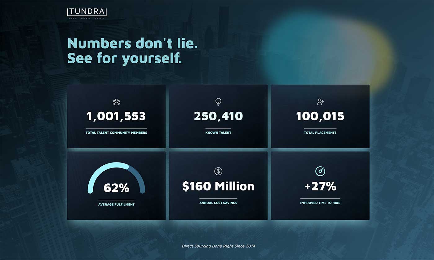
It was someone from Tundra, who received a referral from that original recruiter who reached out to me those years ago. They needed a dashbord to visualize some metrics that could be put on a screen at their booth at some conference, in just a couple of days. Of the hundreds (thousands?) of skilled people they have placed in jobs over the years, I was the one that came to mind. And so, despite the condensed time frame and no actual design to work with, I got to work.
Designing with Refactoring UI in Mind
While I’ve been building websites for many years now, I don’t particularly fancy myself a designer per se, though I dabble when it comes to side projects and personal websites like this present one. I feel like I have a decent eye to see what works or doesn’t, coming up with designs isn’t usually my focus. So, to improve my instincts for my own design, I’ve been reading through Refactoring UI.
For the dashboard project, I was presented with a CodePen link to something a junior dev and cooked up, as well as a short brief to explain the goal and provide some design inspiration along the lines of what they had in mind. Also included were some brand colours, and the actual content and metrics to present.
Hierarchy is Everything
Without a real design to work with, and a condensed timeframe in which to complete the project, I knew I needed to focus on the data. The best way to do this was to make the metrics the focus of the design, and reduce the noise around it as much as possible, while still providing interest and movement somehow.
This “hierarchy is eveything” heading is taken straight out of Refactoring UI. This section provides a lot of meat in terms of placing and highlighting important content. For example, sometimes you need to hand-pick a new colour to use for a label when simply reducing contrast isn’t feasible for reducing an element’s hierarchy.
The design “inspo” that was provided was more or less images of futuristic car dashboards with dark, outer-space sort of aesthetic. This proved challenging when it came to making use of the provided brand colours. I decided that the brand colours could provide a foundation for the design, I needed to pick a custom colour to make the labels readable, and give it that dark, space ship vibe. Enter Tailwind CSS built-in colour options, which provided cyan-200 to help achieve that look, and pair well with the provided grays and teal blues.
The Return of Gradients
I don’t know if this is a design trend, but I feel myself reaching for gradients more and more to provide a bit more interest. They sort of disappeard with the flat-design UI design of the mid-2010s, but perhaps they are making a bit of a resurgence.
For me, the subtle light to dark inside the six tiles of the dashboard provides a bit of a slick, shiny effect that was much more widely used in early smartphone skeumorphic UI design.
Paired with some free icons from heroicons, some subtle animations in the half-donut and speedometer SVGs, and some borrowed ideas from the Tailwind CSS youtube channel for the moving blobs, the animated count-up of the numbers provides just enough motion and interest to keep your eyes on the screen. See the dashboard to get the full effect.
Finally, I looked through their own website to find the background city-scape image, paired with another gradient overlay from black to their own teal blue. This combination was the final piece of the puzzle to give it that slick, urban, car dashboard feel with just a little bit of depth to provide the finishing touch.
All in all, this was a fun, quick project. I’m thankful (and honoured) that the techincal recruiters thought of me, of all their available techincal talent, to create this metrics dashboard. I got to flex some design muscles, and apply of some of the design thinking inspired by Refactoring UI to make it beautiful.
Join my Email List
Get notified about my work with Statamic - from new YouTube videos to articles and tutorials on my blog, and more.