Creating Modals using Alpine.js and Statamic
As part of my ongoing project creating a Statamic starter kit, one of the features I wanted was a modal that could show any arbitrary content, such as a YouTube video, when triggered from any given component. I also wanted the modal to be reusable, such that I don’t end up with multiple modals in the HTML, cluttering up the markup.
I’ve done this any number of times in the various all-React apps I’ve built, but as Statamic and Alpine operate a bit differently, I needed to find a new approach that could allow me to do this. Any of my components should have the capability to insert content into the single modal, and only show that content, even with multiple modal-content-filling components on a given page.
The answer to this puzzle comes from the x-teleport directive, which allows us to place the content of our modal right where we want it, without having to show it right away. We’ll get to that in a bit.
In my project, I’m using Alpine Components (a paid product, which I highly recommend), specifically the Headless Dialog component, but you can effectively build your own version of this using the basic examples from the Alpine docs or following this article, along with Tailwind CSS for styles.
Show me the code
Starting with the JavaScript, we’ll set up a few things that we can reference in our Antlers templates. Our Alpine component file might look something like this:
// Alpine App component

export default () => ({

    isModalOpen: false,
    activeModal: null,

    toggleModal(id) {
        this.isModalOpen = !this.isModalOpen;
        this.activeModal = id;
    },

    // ...etc.
Let’s note the two different properties: isModalOpen which is a boolean, and activeModal which starts as null but will ultimately be simply a string once we get around to that.
As for the toggleModal function, we’ll create a button to call this, which will take that string value as the argument.
Next, let’s look at some Antlers templates in the Statamic project. Starting with the layout.antlers.html, I’ll add the partial for the modal before the closing body tag:
<!-- layout.antlers.html -->

		 {{ partial:components.modal }}
    </body>
</html>
This modal component lives in /resources/views/components/_modal.antlers.html, and has the necessary markup to display the modal the way we want. This is a simplified version to get you started:
<div x-show="isModalOpen">
	<!-- Overlay -->
    <div class="fixed inset-0 bg-black bg-opacity-50"></div>
    <!-- Content -->
    <div class="modal-content">
	    <!-- Actual Content Goes After This -->
	    <div id="modal-slot"></div>
    </div>
</div>
Here, notice the modal-slot element. The x-teleport directive will leverage this as the location after which to place our actual content when a given modal opens.
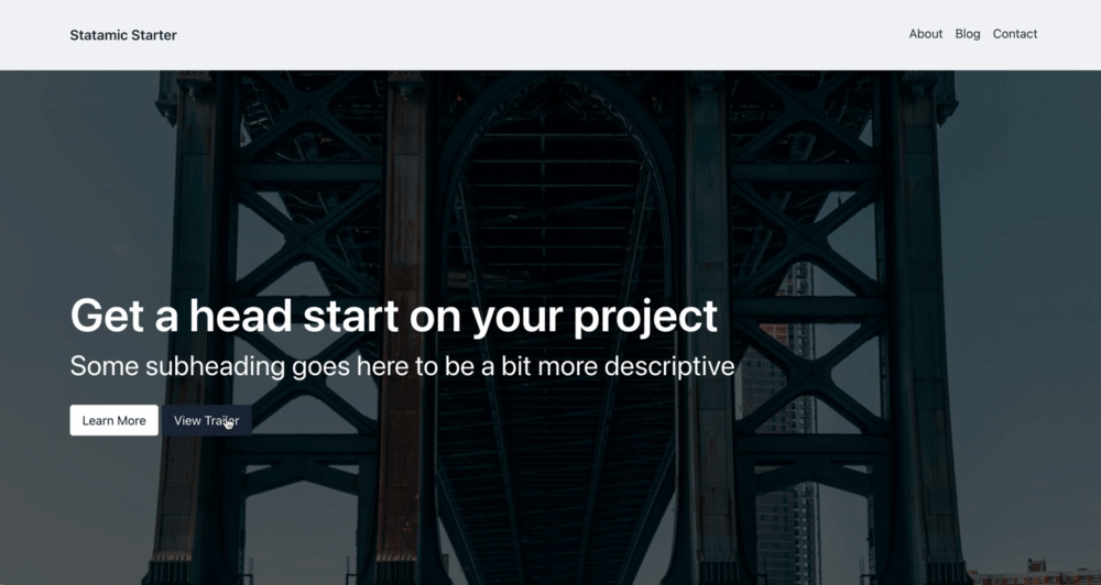
Let’s create a button to trigger the modal, and some content to show in it. The following will be part of my Hero component:
<button @click="toggleModal('hero')" type="button">
    View Trailer
</button>

<template x-teleport="#modal-slot">
   <div class="aspect-video overflow-hidden relative" x-if="activeModal == 'hero'">
       <iframe class="w-full h-full absolute inset-0" src="https://www.youtube.com/embed/tgbNymZ7vqY"></iframe>
    </div>
</template>
The things to note here: first, the toggleModal function called on click passes in the ID of the content we want to show when the modal opens. In this case, the function shows the modal by toggling isModalOpen to true, and setting the activeModal value to hero. Second, the x-teleport directive references the id of the div inside the modal itself. Alpine uses this to place the markup inside the modal, exactly where we want it.
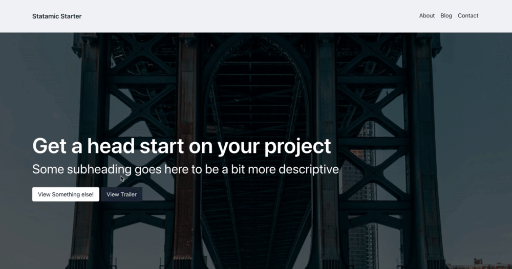
Let’s add another button, and another template to the code here to demonstrate, but these other buttons/templates could live anywhere on the site now. The only thing that needs to be unique is the id passed into the toggle function, and then the unique content itself.
<button @click="toggleModal('somethingUnique')" type="button">
    View something else!
</button>
<button @click="toggleModal('hero')" type="button">
    View Trailer
</button>

<template x-teleport="#modal-slot">
   <div class="aspect-video overflow-hidden relative bg-white p-8" x-if="activeModal == 'somethingUnique'">
        Some other content
    </div>
</template>

<template x-teleport="#modal-slot">
   <div class="aspect-video overflow-hidden relative" x-if="activeModal == 'hero'">
       <iframe class="w-full h-full absolute inset-0" src="https://www.youtube.com/embed/tgbNymZ7vqY"></iframe>
    </div>
</template>
And voila, we have a single modal component that can accommodate multiple chunks of code, one at a time, using the x-if directive. The use of x-if is quite a simple use case for it, but the combination of x-teleport here allows for us to show only the content we want, exactly where we want it, without adding extra HTML to the DOM before we need it.
One more thing…
We can still make one more improvement. Notice that our x-teleport template code is repeated everywhere we want to add modal content. To fix this, we can take advantage of Statamic slots and combine this with the Alpine teleport directive, in another Statamic partial.
Our new component will live in /resources/components/_modal_slot.antlers.html and have all the teleport template markup, with a place for our content. All we need to pass in is that unique id:
<template x-teleport="#modal-slot">
    <template x-if="activeModal == '{{ id }}'">
        {{ slot }}
    </template>
</template>
Then, in our component template where we generate the content, we reference the partial, pass in an id, and the content in between the Antlers tags gets placed into the {{ slot }} of our partial for us. The id gets used in the x-if directive, ensuring it only renders in the DOM when that value is set in the Alpine component:
{{ partial:components.modal_slot id="hero"}}
    <div class="aspect-video overflow-hidden relative">
        <iframe class="w-full h-full absolute inset-0" src="https://www.youtube.com/embed/n9xhJrPXop4"></iframe>
    </div>
{{ /partial:components.modal_slot }}
Now, we can be sure that the x-teleport directive will always reference the correct id of the portal content, and we don’t need to repeat the x-if — it’s all done for us now inside this partial.
Life is good with Alpine and Statamic
The x-teleport directive feels like a bit of magic, and indeed it is. The idea of the “portal” is one of my favourite features in React, and finding it in Alpine, combining together with Statamic’s slot feature made it just the solution I needed to make the single modal component scaleable for use across the Statamic project.
It makes me love and appreciate Alpine (and Statamic) all the more.

Join my Email List
Get notified about my work with Statamic - from new YouTube videos to articles and tutorials on my blog, and more.